If you are like many small business owners and are thinking about how to cut costs while bringing in new business, you may be considering a "do-it-yourself" website. You can save hundreds, even thousands right? The truth is that you may end up hurting your business more than helping it if you don't hire a professional.
Editor's note - we don't want to imply that you should NEVER build your own website...but just consider the risks! There are some people who are patient and skilled enough to make a do-it-yourself website a success. More power to them!
Here's our top 8 reasons why homemade, do-it-yourself websites don't work:
1. You don't have the time
You may be surprised to find out that a lot of people don't even have the time to get a website developed by a professional. There is a lot of work that goes into a website, even if you're not the one physically creating the design or working with the code. You have to decide what should go on the website, what's important, and usually you have to write the content or provide pictures for the designer.
2. Do-it-yourself websites can look generic
Do-it-yourself websites are often called "cookie cutter" websites. There is only so much you can do with the available templates, and your website probably looks like someone else's.
3. There will be bugs
There are so many little details that go into a website that even professionally designed websites can sometimes have bugs that need fixing. Many do-it-yourself sites do not display correctly in every browser because a novice may not do proper testing. And even if a novice was aware of errors, they probably don't have the time or knowledge to troubleshoot them.
4. Your website should look professional
Many people I talk to are proud of their homemade website - and rightfully so! It's very hard and tedious to use any do-it-yourself website software, whether you are a professional or not.
The problem is that the goal of a novice is to make a working website, not a beautiful, interactive, professional looking website. A website should impress your potential customers, and convince them to hire or purchase from you.
5. Do-it-yourself websites are slow to load
Let's ignore the fact that a do-it-yourself website is probably on a slow server. The bigger concern here is that when novices post pictures, they often use the raw file straight from the camera. Then the website software resizes how it looks - but the file itself is still huge. So when someone tries to open the website it takes a long time to open that huge file.
6. You need room for growth
Most do-it-yourself websites have a limit on the number of pages or links you can have, and it's usually very few. So what often happens is that each page becomes really long with way too much verbiage, which is not a good web design practice.
7. Google is crucial
A do-it-yourself website isn't as easy to find on search engines like Google and Yahoo as a professional one is. There are many reasons for this - bad, inefficient coding, title and meta tags, errors in HTML, etc. Probably the biggest one however is that a professional just has the know-how to make a website more successful on the search engines.
8. A website professional has experience
A good web designer brings more to the table than just technical know-how. They should have good ideas of how to make your business a success on the web. At Fresh Look Web Design, we consider ourselves internet marketing consultants as well as web designers. Not only do we create a website for our clients, but we help them USE it effectively.
We do have starter packages for very low cost for anyone looking to get a basic informational website. Get a free price quote or contact us at 757-646-7908 if you are interested.
Saturday, November 26, 2011
Tuesday, November 22, 2011
7 Simple Ways to Build Your Mailing List
One of the most cost effective marketing you can do for your organization is sending out an email newsletter. We've talked about the value of an email newsletter in our article, 8 Reasons to Create an e-Newsletter with Constant Contact. Now we're going to go over some simple, easy ways to encourage people to sign up for your email newsletter.
3. Create a signup form on your website
Adding a little signup box to your website is a very effective way to add people to your mailing list. It can be as big and obvious or as small and subtle as you want. It all just depends on how important it is that people sign up, and what other things on your website need to stand out as well.
One way to do it to put the form directly on every page. This is helpful because it requires less clicking for the user. And if you use something like Constant Contact, you can create it so that when they sign up they are automatically added to your list...no extra work on your part.
Examples of email sign up forms:
4. Offer incentives to sign up
1. Make it easy to sign up
Make it as simple and easy as possible to sign up. Don't require that people enter in more information than is necessary. Name and email address should be enough. The more information you get is good, but people are less likely to take the time to sign up.
2. Let people know what they're getting
Inform your customers what they get with your email newsletter. Make it sound helpful, inviting, simple and non-threatening.
- Coupons
- Helpful tips
- Industry news
- What's New
If you are a small business and typically have close relationships with your customers, you can also add more of a personal flair by informing them of what's going on with your company. New clients, new employees, awards, etc.
Adding a little signup box to your website is a very effective way to add people to your mailing list. It can be as big and obvious or as small and subtle as you want. It all just depends on how important it is that people sign up, and what other things on your website need to stand out as well.
One way to do it to put the form directly on every page. This is helpful because it requires less clicking for the user. And if you use something like Constant Contact, you can create it so that when they sign up they are automatically added to your list...no extra work on your part.
Examples of email sign up forms:
4. Offer incentives to sign up
Give your customers a coupon or small gift just for signing up! You will encourage people who are on the brink of signing up, and the gift can have some good promotional material in it as well.
5. Create a Join My List button on Facebook
If you use Constant Contact, and many people do, you can create a button on your Facebook page which lets people sign up for your email newsletter. It connects with Constant Contact, and is just another way to let users sign up!
See an example of how it works
6. Add a check box that lets users sign up from your Contact Us form
Similar to #3 where you are directly asking users to specifically sign up for your email newsletter, you can also add a field on your Contact Us form which is more subtle.
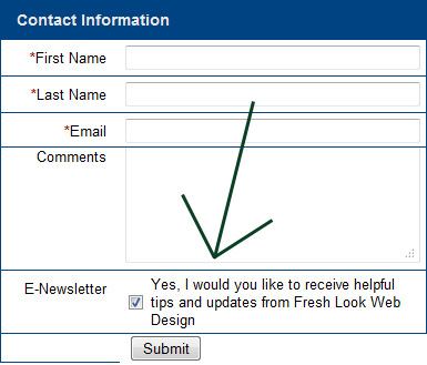
The point is to ask for users to sign up at every opportunity. This one is very helpful at getting good leads for your business since your customers are already taking the time to contact you.
7. Encourage existing subscribers to forward your newsletter to friends
5. Create a Join My List button on Facebook
If you use Constant Contact, and many people do, you can create a button on your Facebook page which lets people sign up for your email newsletter. It connects with Constant Contact, and is just another way to let users sign up!
See an example of how it works
6. Add a check box that lets users sign up from your Contact Us form
Similar to #3 where you are directly asking users to specifically sign up for your email newsletter, you can also add a field on your Contact Us form which is more subtle.
The point is to ask for users to sign up at every opportunity. This one is very helpful at getting good leads for your business since your customers are already taking the time to contact you.
7. Encourage existing subscribers to forward your newsletter to friends
Most programs such as Mail Chimp or Constant Contact let you create an easy to use "Forward this email" button on your newsletter. People love to forward emails (unfortunately) but in this case use it to your advantage.
Sending out an email newsletter really is one of the easiest and cost effective marketing tool you can incorporate. Use these 7 tips to build your mailing list and reap the benefits!
Thursday, October 27, 2011
Don't let your website get cluttered
One of the biggest website hurdles to overcome is that of a super busy website. The information is great, and it's there, but it's not easy to take it all in. Here are some common comments from websites that are too cluttered:
1. Create a Site Map
When your website has lots of information to present, it's very helpful to organize it by categories. Here is an example site map:
The best way to align your images with text wrapped around.
The not so good way to align your images.
4. Ask people what they think
Since we know our own websites inside and out, we often don't have the correct point of view. Ask people who don't look at your website very much what they think. Is it easy to navigate? Is it intuitive? Or do they look at it blankly not really knowing what to do, click on, or read?
Hopefully these tips help you keep your website usable and not too cluttered. Remember that your users want to find things easily and quickly. Good luck!
- my website is too busy
- it's too hard to find information
- there's just too much stuff
- I don't know what to click on
1. Create a Site Map
When your website has lots of information to present, it's very helpful to organize it by categories. Here is an example site map:
- Home
- About Us
- Our Company
- Our History
- Our Staff
- Testimonials
- Our Company
- Services
- Press Room
- Contact Us
2. Clean up your home page
The tendency for every website is to post every bit of new information to your home page. This is OK, as long as your remove the not-so-new information from the home page at the same time.
It's actually very helpful to keep your home page updated with "What's New" type of things. It's just when you forget to take them down when they're not new anymore is when you run into problems.
3. Keep pictures organized
Nothing will make a website look more jumbled than having random, huge images scattered randomly on your website. Make sure all your pictures follow these guidelines:
- Resize them. Make sure they're big enough to view, but still fairly small. Allow users to click them to view larger version if necessary.
- Use photo galleries. If you want to use large photos then keep them organized in a photo gallery where people can view them if they want to.
- Add some extra padding in between your images and the text or the end of the screen. Having things too close together makes it look cluttered.
- Wrap text around pictures. It looks good to fill up any empty space on your website with text. See the example below:
The best way to align your images with text wrapped around.
The not so good way to align your images.
4. Ask people what they think
Since we know our own websites inside and out, we often don't have the correct point of view. Ask people who don't look at your website very much what they think. Is it easy to navigate? Is it intuitive? Or do they look at it blankly not really knowing what to do, click on, or read?
Hopefully these tips help you keep your website usable and not too cluttered. Remember that your users want to find things easily and quickly. Good luck!
Wednesday, October 5, 2011
Use Facebook's "Like" Button
The word has gotten out that having a Facebook page can help your business or non-profit. But what a lot of people do not know is how to really utilize your Facebook page with your website.
One way to do that is with Facebook's "Like" button. Putting a "Like" button on your website is a very good idea for people who want to better use Facebook and their website for their business.
Here's why you should do it:
1. It's easy to set up
Facebook even gives you the code! Go here - https://developers.facebook.com/docs/reference/plugins/like/, fill out the form and copy and paste the code into your website. If you need help with it, feel free to ask us.
2. It's easy for your users
At the top of each page on our website is a "Like" button. All our users have to do is click that button and they're done! If they're not logged in to Facebook, they will be prompted to do so.
3. It spreads the word about your website
When someone clicks the "Like" button, it shows up on their News Feed. So their friends will see that they "Like" your website, and your website will get more traffic!
4. You can track it
Facebook has a page called "Insights" which gives you key stats about who "Likes" your webpage! Go to http://www.facebook.com/insights/ and follow the onscreen instructions to view the Facebook stats for your website. Here's a very helpful step by step guide if you have trouble - http://www.wisnet.com/blog/using-facebook-insights-to-track-the-like-button-box-and-shares/.
Note that you may not see demographic information on your fans if you don't have very many fans yet. Facebook will hide that until you get a certain number of fans. But once you reach that point, then you can see very valuable information such as gender, age, or where they live.
If you have a Facebook page, we definitely recommend adding the "Like" button to it!
Wednesday, September 28, 2011
Is your website optimized for smart phones?
So many people today are browsing the internet on smart phones. Even if you don't use one, there are a lot of people out there visiting your website on their phone. In this article we will talk about a great way to optimize your website for smart phones.
Mobile Only Website
The best way to optimize for smart phones is to create a mobile only website. If you don't use a smart phone, you probably haven't seen a mobile only website before.
Example: If you go to www.bestbuy.com on a smart phone you see a completely different website than if you go to www.bestbuy.com on a regular computer.
Why is this? Best Buy has created a "mobile only" version of their website. The website can detect if the user is on a smart phone, and when that happens, they direct them to the mobile only version.
What are some features of mobile only versions?
- Smaller
- Fast loading
- Fewer pictures and graphics
- Only displays the most important information
- Contact info and directions very prominent
- Link back to the full version of website (for users who just really want to see the regular website)
What if I don't have a mobile only version?
Most likely, your website is still accessible to a smart phone. It just won't be quite as easy for them to use your website, and there may be errors. There are a few things that you may have on your website that may cause problems for mobile users:
- Flash
- Errors in CSS or HTML
- Very wide design
- Frames
- Nested tables
How to test your website
Here's a link to a mobile simulator - www.opera.com/mobile/demo. If you go there, you can enter in a website address to see how it will look like on the Opera browser for smart phones. For testing purposes, try entering in our website, www.freshlookwebdesign.com. You should get forwarded to our mobile only version.
Most people we talk to are not familiar with the idea of having a mobile only version of their website. However it's a very nice, inexpensive feature to have. If you don't add it now, then it will just become even more important to do so in the coming years as more people get smart phones. We expect it will eventually become standard for every website to have a mobile only version.
Have a question? Call or email at 757-646-7908 or info@freshlookwebdesign.com.
Friday, June 10, 2011
10 Questions to ask before hiring a web designer
"I want a website, but I don't really know what to ask you...can you help me?"
This is the question we hear the most when talking to people who need a website. This article is designed to help some of you who aren't sure which questions to ask.
Here are the 10 most important questions to ask:
1. Can I see your portfolio?
First thing to do is see their work. If a web design firm has websites that you like, then you're off to a good start.
2. What will my fee be after the first year?
Most design firms will charge a fee up front to create the website, and then either a monthly or yearly fee for hosting and maintenance.
Make sure you ask what the estimated cost will be going forward...the initial fee may be reasonable but if you can't sustain it after that then find something cheaper.
3. Can I update my own website?
If you plan on making updates to your website on a regular basis, then it's usually a good idea to do it yourself rather than paying your web designer to do it for you. It can really save you a lot of money down the road.
Read our article here about how to easily update your website.
4. How are we going to make conversions?
This is very often overlooked but extremely important. A conversion happens when a visitor comes to your website and does...whatever it is you want them to do.
For our website, when a person contacts us by phone or email that's a conversion.
So a good answer to this question would be something like:
Read our article about how to create a good call to action button.
5. Can we link my Facebook and Twitter accounts to my website?
For some reason we've talked to a couple people who said their web designer wouldn't do this for them. Or that it would cost a lot of money.
For the record, it takes approximately 20 seconds to link your Facebook or Twitter page to your website.
6. Will my website be Search Engine Friendly?
If a web designer looks at you blankly when you ask this question...run away.
A good response would be something about:
Read our article about how to improve your SEO.
7. Can my website grow if my company grows?
Say your company offers a new product or service. Is your website built in such a way where it can add new buttons without having to redesign the whole thing for a large fee?
Make sure that your website has room to grow.
8. What happens if you disappear?
Everyone's worst nightmare is that their developer will just leave one day and you won't be able to access your website.
If this is a concern, just make sure you ask for a backup copy of the website once every few months or something. It's a legitimate question to ask especially if your web designer is a freelancer. Freelancers are great because of the low cost, but there is risk involved.
9. Are you using a template to design my website?
Some designers use templates when creating a website because it saves them time. Rather than create a unique, custom design they just throw your information into a template.
The problem with templates is that your website may look the same as someone else's. And that's not a good thing.
If you know that's what you're getting and you're paying less, then that's OK. But if you are paying hundreds or even thousands of dollars for a template, then you're probably paying too much.
10. Will you give my website a Fresh Look?
Studies show that unless the term "fresh look" actually appears in a companies name...ok just kidding. In all seriousness, there are a lot of good web design firms out there, just make sure you ask the right questions when getting started. Good luck!
This is the question we hear the most when talking to people who need a website. This article is designed to help some of you who aren't sure which questions to ask.
Here are the 10 most important questions to ask:
1. Can I see your portfolio?
First thing to do is see their work. If a web design firm has websites that you like, then you're off to a good start.
2. What will my fee be after the first year?
Most design firms will charge a fee up front to create the website, and then either a monthly or yearly fee for hosting and maintenance.
Make sure you ask what the estimated cost will be going forward...the initial fee may be reasonable but if you can't sustain it after that then find something cheaper.
3. Can I update my own website?
If you plan on making updates to your website on a regular basis, then it's usually a good idea to do it yourself rather than paying your web designer to do it for you. It can really save you a lot of money down the road.
Read our article here about how to easily update your website.
4. How are we going to make conversions?
This is very often overlooked but extremely important. A conversion happens when a visitor comes to your website and does...whatever it is you want them to do.
For our website, when a person contacts us by phone or email that's a conversion.
So a good answer to this question would be something like:
- We'll put your phone number at the top of the site so people can easily see it
- We will feature your upcoming events in a "What's New" rotating slideshow that is visually appealing right on the home page
- We will make sure that we're pushing people to download your brochure
- We will have your featured products that are on sale on every page so that people can see them no matter where they are in the website
Read our article about how to create a good call to action button.
5. Can we link my Facebook and Twitter accounts to my website?
For some reason we've talked to a couple people who said their web designer wouldn't do this for them. Or that it would cost a lot of money.
For the record, it takes approximately 20 seconds to link your Facebook or Twitter page to your website.
6. Will my website be Search Engine Friendly?
If a web designer looks at you blankly when you ask this question...run away.
A good response would be something about:
- Using CSS instead of Tables
- Using text instead of images
- HTML valid code
- Good title tags
- Adding keywords to the text in key places
Read our article about how to improve your SEO.
7. Can my website grow if my company grows?
Say your company offers a new product or service. Is your website built in such a way where it can add new buttons without having to redesign the whole thing for a large fee?
Make sure that your website has room to grow.
8. What happens if you disappear?
Everyone's worst nightmare is that their developer will just leave one day and you won't be able to access your website.
If this is a concern, just make sure you ask for a backup copy of the website once every few months or something. It's a legitimate question to ask especially if your web designer is a freelancer. Freelancers are great because of the low cost, but there is risk involved.
9. Are you using a template to design my website?
Some designers use templates when creating a website because it saves them time. Rather than create a unique, custom design they just throw your information into a template.
The problem with templates is that your website may look the same as someone else's. And that's not a good thing.
If you know that's what you're getting and you're paying less, then that's OK. But if you are paying hundreds or even thousands of dollars for a template, then you're probably paying too much.
10. Will you give my website a Fresh Look?
Studies show that unless the term "fresh look" actually appears in a companies name...ok just kidding. In all seriousness, there are a lot of good web design firms out there, just make sure you ask the right questions when getting started. Good luck!
Saturday, May 21, 2011
Easy SEO Checklist
One of the most often asked questions is on the subject of SEO or "Search Engine Optimization". Simply put - how can my website get found on the search engines?
There are a lot of ways to improve your search engine ranking...more than we can put in one little blog post. But here is a helpful little guide for beginners so that you can have the basics down.
1. Use your words
Search engines love content. The more words you have on the page, the more likely the search engines will like your page. This has to be balanced with keeping your website succinct and easy to read for your users, but make sure you have good content on each page describing your products, services, etc.
2. Have a good title tag
Look at the very top of this page - see where it says "Fresh Look Web Design | Easy SEO Checklist"? That is the title tag.
Essentially what you want to do in your Title Tag is put the name of your business, and a very brief description of what you do.
So for example, a fictitious auto mechanic shop in Chicago called Joe's Professional Auto would have a Title Tag something like this:
"Chicago auto mechanic and car repair shop - Joe's Professional Auto"
That way if someone looking for a mechanic in Chicago types "Chicago car repair" into Google...well what do you know, Joe has that exact phrase in his Title Tag.
"Chicago auto mechanic and car repair shop - Joe's Professional Auto"
3. Use text instead of images for links when possible
Search engines can't read what an image says. If possible, use text on a background image instead of just an image. It requires more work and expertise to create that type of link, but in the long run the search engines will thank you.
4. Put physical address on every page
There are indications that Google puts more trust in your site if you include your physical address on every page. It also helps build trust with your customers if they know where you're actually located.
A couple good places to put your address on each page is at the top (http://tidewaterrcd.org/) on a menu on the side (http://www.chincoteaguechamber.com/) or at the bottom (http://www.cross-associates.com/).
5. Link your social media to your website
Every business should at a bare minimum have a Facebook business page. Whether you have just Facebook, or a large number of social media presences, make sure they have a link to your website.
6. Write a good meta description
The meta description tag is a bit of HTML code in the head section of the document. You'll sometimes see the meta description tag in the search engine results pages (SERPs).
What you put in the meta description tag is simply a brief description of your business and maybe some specific information about the page it's on.
Do your best to include a couple good keywords, but make sure it's readable and helpful to your potential visitors. Here's what our meta description says:
Fresh Look Web Design is a full service graphic design and web development company serving Hampton Roads and all of Virginia.
Notice that we not only describe our business, but include some good keywords as well.
7. Put good keywords in your h1 tag
Each page should have a header at the top identifying the page. Search engines specifically look for the h1 tag on your page. It should appear one time and include a keyword if possible.
It's not enough to just have larger, bold text at the top. It specifically needs to be an h1 tag.
8. Use a readable URL
Sometimes when a website is setup in a CMS, the URL's for each page are not search engine friendly. Here's an example of what they might look like:
http://freshlookwebdesign.com/index.cfml?productid=3&categoryid=5 to go/productid/3/categoryid/5
Not very search engine friendly. Instead, it should say something like http://freshlookwebdesign.com/services/small-business-web-design.php
You want to include a good keyword in the URL if possible as well.
Using these tips will go a very long way in making your website search engine friendly. Even if you can't implement all of them, even just a few should improve your position in the search engines and bring more visitors to your website.
Friday, May 20, 2011
5 things web designers don't want you to know
OK Let's be honest...if you have had a not-so-good experience with a web designer at one point in time you are not alone. We talk to folks all the time who are very wary of being burned again. It's very unfortunate.
Today we want to share a few facts which will hopefully enlighten some of you and give you the insight you need to make smart business decisions. Here are the top 5 things that web designers don't want you to know (but we're going to tell you anyway).
1. Most maintenance updates take less than 30 minutes
If a website is constructed correctly, then 90% of maintenance updates are a piece of cake. Even creating new pages of brand new content is not a time consuming process for a professional.
Some things will take longer of course, but the important thing to take away here is that if you're being billed hourly, there are a couple things you can do to reduce that hourly rate.
2. Hosting is not very expensive
Hosting is pretty cheap...especially for a fairly small static website of less than 50 pages.
So what does this mean? If you don't ask your web developer to change your website very often, then really you shouldn't be paying him a whole lot. Most of our small business websites pay us between $400 - $700 a year for hosting AND 5 hours of maintenance.
3. It's possible to update your own website
This fact is more well known now than it was 4 or 5 years ago. But one way to drastically cut down on expenses is just to update your website yourself through a "Content Management System" or CMS.
A CMS is simply a tool that lets you manage the content of your website. You can add new pages, update your information, add pictures, etc.
Now of course you need the time to do it, which a lot of people simply don't have. But if possible hire an intern or get some help. If you're making updates to your website on a regular basis, it pays to have a CMS.
4. Your website needs to be constructed correctly to get found on search engines
It seems like half the websites online are not search engine friendly. Whether it's because the person who created it didn't know the right way to do it, or they were lazy when they created it; so many websites today are not suited for search engine crawlers.
Make sure your website is constructed correctly. As any SEO firm will tell you, there are many different things to check. Here's a free article which will answer the question is my website search engine friendly - it's our Easy SEO Checklist, mainly for beginners.
5. Your web designer might not be an actual web designer
Say what? A web designer is someone who is an expert in graphic design, SEO, HTML, CSS, and website usability (at a minimum).
Most "web designers" are people who may know how to do one or two of these things, not all of them. Just because you know HTML doesn't mean you can create an effective small business website.
When talking to a web designer, make sure they don't just know how to make a website, but how to make it look good, and how to make it work.
We recommend that you ask to see their portfolio, and then ask them to show you some real life examples of businesses they've helped. Then talk to those businesses as a reference and see what they say.
Hopefully these facts will help give you the knowledge you need to make smart business decisions. Don't forget to contact us if you need a free consultation. Good luck!
Today we want to share a few facts which will hopefully enlighten some of you and give you the insight you need to make smart business decisions. Here are the top 5 things that web designers don't want you to know (but we're going to tell you anyway).
1. Most maintenance updates take less than 30 minutes
If a website is constructed correctly, then 90% of maintenance updates are a piece of cake. Even creating new pages of brand new content is not a time consuming process for a professional.
Some things will take longer of course, but the important thing to take away here is that if you're being billed hourly, there are a couple things you can do to reduce that hourly rate.
- Combine your updates into one single update. Rather than sending five separate small updates over five separate days, send them all at once. It's possible that your developer can do all of them in an hour, which will make your invoice an hour worth of work instead of five hours
- Try to hire a web developer that bills in half hour increments. For small updates, this will reduce your cost in half
2. Hosting is not very expensive
Hosting is pretty cheap...especially for a fairly small static website of less than 50 pages.
So what does this mean? If you don't ask your web developer to change your website very often, then really you shouldn't be paying him a whole lot. Most of our small business websites pay us between $400 - $700 a year for hosting AND 5 hours of maintenance.
3. It's possible to update your own website
This fact is more well known now than it was 4 or 5 years ago. But one way to drastically cut down on expenses is just to update your website yourself through a "Content Management System" or CMS.
A CMS is simply a tool that lets you manage the content of your website. You can add new pages, update your information, add pictures, etc.
Now of course you need the time to do it, which a lot of people simply don't have. But if possible hire an intern or get some help. If you're making updates to your website on a regular basis, it pays to have a CMS.
4. Your website needs to be constructed correctly to get found on search engines
It seems like half the websites online are not search engine friendly. Whether it's because the person who created it didn't know the right way to do it, or they were lazy when they created it; so many websites today are not suited for search engine crawlers.
Make sure your website is constructed correctly. As any SEO firm will tell you, there are many different things to check. Here's a free article which will answer the question is my website search engine friendly - it's our Easy SEO Checklist, mainly for beginners.
5. Your web designer might not be an actual web designer
Say what? A web designer is someone who is an expert in graphic design, SEO, HTML, CSS, and website usability (at a minimum).
Most "web designers" are people who may know how to do one or two of these things, not all of them. Just because you know HTML doesn't mean you can create an effective small business website.
When talking to a web designer, make sure they don't just know how to make a website, but how to make it look good, and how to make it work.
We recommend that you ask to see their portfolio, and then ask them to show you some real life examples of businesses they've helped. Then talk to those businesses as a reference and see what they say.
Hopefully these facts will help give you the knowledge you need to make smart business decisions. Don't forget to contact us if you need a free consultation. Good luck!
Wednesday, April 13, 2011
8 Features of a Great Call to Action Button
The best way to get visitors to do what you want them to do on your website is to create an effective call to action button.
A call to action button is simply a button people click on that says something like:
1. Color contrast
The color of the button should stand out from the surrounding elements on your website. So if you have a white background, don't have a light button. Make it a dark color.
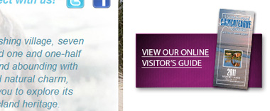
The Chincoteague Chamber of Commerce uses purple for this image to make the important Visitor Guide button stand out.
2. Give a few details
Some users want to know a little more information before they click on something. Keep it brief, but give them a few more details if it fits on your button and looks good.
If you'll look at our buttons on the right, you'll notice that we have the call to action statement in bold type, followed by a short explanation.
3. Don't make it scary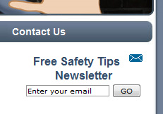
There are some terms that people seem to shy away from. If a web user thinks they're making a long term commitment that will be hard to get out of they're less likely to click it.
Don't say: "Register" or "Sign up"
Instead, say: "Receive Updates" or "Stay Connected"
These friendly terms are more inviting and people are more likely to click on it.
Defy the Bad Guy uses the phrase "Free Safety Tips Newsletter" rather than something like "Sign up to receive our newsletter". After all, who doesn't want to be safe? And who doesn't like free?
4. Keep distractions to a minimum
It's very easy to make a website too cluttered. But by adding a lot of stuff, we end up losing the effectiveness of what we started with.
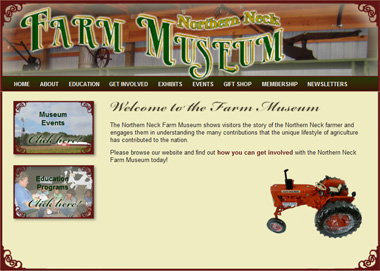
Sometimes less is more. The Northern Neck Farm Museum keeps their home page very simple to emphasize the buttons on the left to make sure that the important items are easy to see and there are no unnecessary distractions.
5. Use white space
White space, as mentioned in our article on How to Make Your Web Content Look Amazing is the blank or empty space surrounding elements on your web page. White space can really make your call to action button stand out and get noticed.

6. Put it at the top of the page
The "above the fold" principle is what the user sees on their screen without scrolling down. If feasible, put your important call to action buttons "above the fold".
A lot of times it's not practical to put your call to actions at the top. Maybe it's not how you want your website styled, or you have something else at the top that you want to highlight. That's OK...this is just one way to do it.
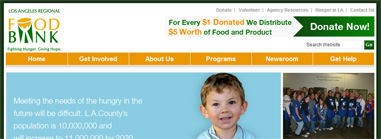
The Los Angeles Regional Food Bank uses two techniques for their call to action button - positioning it at the top of the page, and high contrast. They have a dark green button on a white background.
7. Give more than just one option
We always want people to "Buy Now" but what if they're not ready? They don't want to "Buy Now", but they do want to "Learn More". Give them the option to do that.
A cautious customer will take baby steps towards the ultimate goal. In baseball, a walk, stolen base and a base hit scores 1 run...same as a 450 foot home run. Let them go at their own pace.
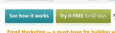
Constant Contact wants people to sign up for their free trial...but maybe people just want to "See how it works".
8. Give the button a "hover" feature
Users like it when a button lights up when they hover the mouse over it. Our buttons on the right do this as well...they turn a slightly brighter yellow. It's just an attractive, simple way to let your users know that it is in fact a button that you can click on.
Creating a good call to action button can really help you reach your website goals. We hope you can incorporate these ideas into your website and improve the effectiveness of your online presence!
A call to action button is simply a button people click on that says something like:
- Sign up now
- Call us today
- Get a free quote
- Download our brochure
- Read more
1. Color contrast
The color of the button should stand out from the surrounding elements on your website. So if you have a white background, don't have a light button. Make it a dark color.
The Chincoteague Chamber of Commerce uses purple for this image to make the important Visitor Guide button stand out.
2. Give a few details
Some users want to know a little more information before they click on something. Keep it brief, but give them a few more details if it fits on your button and looks good.
If you'll look at our buttons on the right, you'll notice that we have the call to action statement in bold type, followed by a short explanation.
3. Don't make it scary
There are some terms that people seem to shy away from. If a web user thinks they're making a long term commitment that will be hard to get out of they're less likely to click it.
Don't say: "Register" or "Sign up"
Instead, say: "Receive Updates" or "Stay Connected"
These friendly terms are more inviting and people are more likely to click on it.
Defy the Bad Guy uses the phrase "Free Safety Tips Newsletter" rather than something like "Sign up to receive our newsletter". After all, who doesn't want to be safe? And who doesn't like free?
4. Keep distractions to a minimum
It's very easy to make a website too cluttered. But by adding a lot of stuff, we end up losing the effectiveness of what we started with.
Sometimes less is more. The Northern Neck Farm Museum keeps their home page very simple to emphasize the buttons on the left to make sure that the important items are easy to see and there are no unnecessary distractions.
5. Use white space
White space, as mentioned in our article on How to Make Your Web Content Look Amazing is the blank or empty space surrounding elements on your web page. White space can really make your call to action button stand out and get noticed.
6. Put it at the top of the page
The "above the fold" principle is what the user sees on their screen without scrolling down. If feasible, put your important call to action buttons "above the fold".
A lot of times it's not practical to put your call to actions at the top. Maybe it's not how you want your website styled, or you have something else at the top that you want to highlight. That's OK...this is just one way to do it.
The Los Angeles Regional Food Bank uses two techniques for their call to action button - positioning it at the top of the page, and high contrast. They have a dark green button on a white background.
7. Give more than just one option
We always want people to "Buy Now" but what if they're not ready? They don't want to "Buy Now", but they do want to "Learn More". Give them the option to do that.
A cautious customer will take baby steps towards the ultimate goal. In baseball, a walk, stolen base and a base hit scores 1 run...same as a 450 foot home run. Let them go at their own pace.
Constant Contact wants people to sign up for their free trial...but maybe people just want to "See how it works".
8. Give the button a "hover" feature
Users like it when a button lights up when they hover the mouse over it. Our buttons on the right do this as well...they turn a slightly brighter yellow. It's just an attractive, simple way to let your users know that it is in fact a button that you can click on.
Creating a good call to action button can really help you reach your website goals. We hope you can incorporate these ideas into your website and improve the effectiveness of your online presence!
Monday, April 11, 2011
Your Website and How to Get Your Point Across
Ever feel like your website just sort of...sits there? It's great to have a website to promote your business but without a specific goal and plan to achieve that goal, you're not going to get much out of it.
Your website may have several goals in mind, but most likely a couple of them are more important than the rest. You don't have to exclude the secondary goals, but SOMETHING has to stand out.
The first thing to do is figure out specifically what it is you want your web visitors to do. Here are some ideas of actions you want your web visitors to take right from your website:
Here is the 3 step process to get results on your site:
Web user sees something interesting
So how do you make sure your web user sees something interesting? Here's how - repetition. Don't just mention it once and hope they get the message. You should list it in 3 different places:
If you emphasize your key points in these 3 places than you your web users should notice it.
Web user clicks a link to find out more
How do you get them to actually click that button? That's another topic by itself, but you need to use a good call to action button. Here's one of our articles that describes how to create a good call to action button.
After your user clicks a call to action button you only have one more step to take.
You tell them how to take action
There are 2 good ways to make a conversion on a website. You want your web visitor to either call you, or fill out a contact form. Make these two options very easy to do. Some people are more likely to fill out a form, others want to call. Give options and keep it simple.
Here's a couple examples of sites which have a nice and simple Contact Us page with phone number and a contact form:
Don't forget to contact us if you need a free consultation on your website or internet marketing.
Your website may have several goals in mind, but most likely a couple of them are more important than the rest. You don't have to exclude the secondary goals, but SOMETHING has to stand out.
The first thing to do is figure out specifically what it is you want your web visitors to do. Here are some ideas of actions you want your web visitors to take right from your website:
- Request a price quote straight from the website
- Receive online donations via credit card
- Find out about a specific product or service
- Stay updated on local events or attractions
Here is the 3 step process to get results on your site:
- Web user sees something interesting
- Web user clicks a link to find out more
- You tell them how to take action
Web user sees something interesting
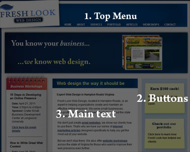
So how do you make sure your web user sees something interesting? Here's how - repetition. Don't just mention it once and hope they get the message. You should list it in 3 different places:
- Main navigation - on our website, the main navigation is the blue menu bar at the very top. Anything important should be accessible through the main navigation.
We utilize the drop down menus for secondary pages and we recommend that you do the same. It makes it much easier on your web users. - Buttons or graphics - we have a couple buttons on the right side of our page that we REALLY want our web users to click on. It's in the menu at the top also, but we repeat it on the side as a button because we want to make sure people visit it.
- In the main content area of your text - most people will click on a button like in #2 long before they read the text on your website. But you should still mention important things in the body of your text.
If you emphasize your key points in these 3 places than you your web users should notice it.
Web user clicks a link to find out more
How do you get them to actually click that button? That's another topic by itself, but you need to use a good call to action button. Here's one of our articles that describes how to create a good call to action button.
After your user clicks a call to action button you only have one more step to take.
You tell them how to take action
There are 2 good ways to make a conversion on a website. You want your web visitor to either call you, or fill out a contact form. Make these two options very easy to do. Some people are more likely to fill out a form, others want to call. Give options and keep it simple.
Here's a couple examples of sites which have a nice and simple Contact Us page with phone number and a contact form:
- http://themasterstouchpainting.com/contact/
- http://seashellmotel.org/contact/
- http://www.haleyesgenerators.com/about-us/contact-us
Don't forget to contact us if you need a free consultation on your website or internet marketing.
Friday, March 25, 2011
How to Advertise Your Events with Facebook
If you have a Facebook page for your business, sometimes it's hard to know what to post. However, one easy thing that you should definitely advertise through Facebook is your upcoming events.
Here's how you do it:
Note: We're writing this with the assumption that this is all done from a Facebook fan page, not a personal account.
As soon as you have a new event on your calendar, go to your Facebook business page and click on Events. Depending on what "version" of Facebook you have (they're always updating it), you will see it on the left or the top. Click on "Create an Event".
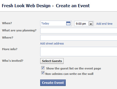
The next screen should look something like the one above. From here you can enter in the details for your event...day and time, location, address, descriptions, etc.
Invite Guests
Before you actually create the event you'll also want to invite specific guests. Click on "Select Guests" and click on your friends who you want to invite to the event. Don't worry - even people who you haven't invited can still see the event. This is a nice feature because you can see who's responded later on, plus it makes sure your fans are aware of the event.
After you have selected friends to invite, click on "Create Event". Your event is created and will now appear on the News Feed of your fans.
There are still a few details to take care of. Go back to the main page of your Facebook business page and click on the event.
Here you should see the details of the event you created - but you will also see where you can add even more information.
Link to Website
We recommend adding a link here that leads to the events page of your website. This is helpful for a few reasons - you can more accurately track who is interested, usually your website is a more effective marketing tool than Facebook, and also you may want people to register for the event or pay directly from your website.
After you add the link to your website there are a few other options...you can add pictures to the event, video, or just add more information.
Update your Fans...Fail
There is also an option to "Update fans of..." to send an update to your fans. Unfortunately as of the time of this writing, sending an "update" from a Facebook business page is largely ineffective. Your fans don't get an email or notification, and it doesn't appear on their News Feed. The only place it shows up is as an "Event" on the left side of their main page. Most people never click this so they are unaware they were "updated".
So how do your fans know about the event? There are 3 main ways:
1. When you created the event it appeared in their News Feed
2. If you invited them as a guest (they have to be your friend, not just fan) they will receive a notification
3. When the event gets a little closer you should post a reminder on your wall to have people check out your event. This will also appear in their News Feed.
Adding your upcoming events to Facebook only takes a couple minutes, yet can really be effective in helping share the word. Make sure to use this valuable tool and you'll begin to see more people showing up to your events!
Here's how you do it:
Note: We're writing this with the assumption that this is all done from a Facebook fan page, not a personal account.
As soon as you have a new event on your calendar, go to your Facebook business page and click on Events. Depending on what "version" of Facebook you have (they're always updating it), you will see it on the left or the top. Click on "Create an Event".
The next screen should look something like the one above. From here you can enter in the details for your event...day and time, location, address, descriptions, etc.
Invite Guests
Before you actually create the event you'll also want to invite specific guests. Click on "Select Guests" and click on your friends who you want to invite to the event. Don't worry - even people who you haven't invited can still see the event. This is a nice feature because you can see who's responded later on, plus it makes sure your fans are aware of the event.
After you have selected friends to invite, click on "Create Event". Your event is created and will now appear on the News Feed of your fans.
There are still a few details to take care of. Go back to the main page of your Facebook business page and click on the event.
Here you should see the details of the event you created - but you will also see where you can add even more information.
Link to Website
We recommend adding a link here that leads to the events page of your website. This is helpful for a few reasons - you can more accurately track who is interested, usually your website is a more effective marketing tool than Facebook, and also you may want people to register for the event or pay directly from your website.
After you add the link to your website there are a few other options...you can add pictures to the event, video, or just add more information.
Update your Fans...Fail
There is also an option to "Update fans of..." to send an update to your fans. Unfortunately as of the time of this writing, sending an "update" from a Facebook business page is largely ineffective. Your fans don't get an email or notification, and it doesn't appear on their News Feed. The only place it shows up is as an "Event" on the left side of their main page. Most people never click this so they are unaware they were "updated".
So how do your fans know about the event? There are 3 main ways:
1. When you created the event it appeared in their News Feed
2. If you invited them as a guest (they have to be your friend, not just fan) they will receive a notification
3. When the event gets a little closer you should post a reminder on your wall to have people check out your event. This will also appear in their News Feed.
Adding your upcoming events to Facebook only takes a couple minutes, yet can really be effective in helping share the word. Make sure to use this valuable tool and you'll begin to see more people showing up to your events!
Tuesday, March 15, 2011
Make your Web Content Look Amazing
In a past article on content writing we talked about what to write about. Now we're going to put that to the side and talk about how to style your web content. This is helpful for those of us who manage our own websites; it's also helpful if you have someone do it for you because now you can know what to look for.
Text on a page is boring right? Answer - it doesn't have to be. Here are a few ideas on how to make your content look interesting.
1. Use white space
White space is simply the extra padding in between the words and whatever the words are next to. So for example, in this article the words are on a white background, and next to it is a gray background. The gap in between where the words stop and the gray background begins is the white space.
White space makes your website look less cluttered. It also makes it much easier to read. Help out your readers by making sure that you have some extra white space around your text.
2. Make sure the font size is readable
A good rule of thumb is that it's better to be on the safe side when it comes to font size. A lot of people (and I'm one of them) prefer the look of a smaller font. But it's best to make sure that everyone can read your text very easily.
3. Use the correct background
While we're on the subject of readability, let's talk about colors. We've mentioned this before in 8 Website Blunders to Avoid, but it's very important that your text be a very dark color on a very light background. It doesn't have to be black on white, (although that is very common) and there's nothing wrong with dark gray or dark blue, but make sure there's a very stark contrast between the words and the background behind it.
One thing we didn't mention in the previous article is that it's also OK to reverse it and have a black background with white text. Sometimes this looks good on an "artsy" website for a photographer, rock band, etc. Just keep in mind that it is harder to read white text on a black background so make sure you compensate for it with extra white space, font size, and...
5. Line spacing
Line spacing is the gap between subsequent lines in a paragraph. Good line spacing will allow readers to easily scan your paragraphs without having to squint.
6. Use some photos
Conveniently, we just wrote an article on how to use pictures in your web content. The second item in that list is to "Use Scattered Images". If you didn't read the article what we mean is this - when you have a lot of text, make it look more interesting by putting a relevant picture next to the text to break it up. It will just make everything look much more interesting and professional.
7. Include some hyperlinks in your content
Hyperlinks serve a dual purpose in this context. First and most importantly, they direct your users to other interesting content that they may way to check out. But secondly, the links look nice.
Look at the link above. The added color just makes that paragraph look a little bit more interesting. Granted, the link isn't very descriptive so some people won't click it, but that's OK in some cases because maybe you're just adding some color to the paragraph.
Writing for the web is a difficult task for anyone. Remember that it's harder to read text on a computer screen than on paper. Using these suggestions will help grab the readers attention and help you reach your online goals.
Friday, February 11, 2011
The 4 best ways to use photos on your website
Most websites, if not all, look much better with good pictures. But what is the best way to present those pictures? Believe it or not, you can make your website look unprofessional even with the best of pictures.
It's not just how good your photos are that matters, but also how you present them. For example, if your website is cluttered with photos then it won't be attractive. No one likes clutter.
Another way to make your site look unprofessional even with good photos is to not size them properly. If they're too small then they're unimpressive and won't get noticed. If they're too large than they're overwhelming. The right balance is necessary.
Here are the 4 best ways to incorporate pictures into your website:
Example: Our portfolio page at www.freshlookwebdesign.com/portfolio
Benefits: You can post a lot of pictures without slowing down the page load speed because the large images aren't loaded until you click on them.
Downside: No huge downside here, but one thing is that the thumbnails on the page won't look as good as a full sized image would. In other words, there's no real aesthetic value until the images are actually clicked on.
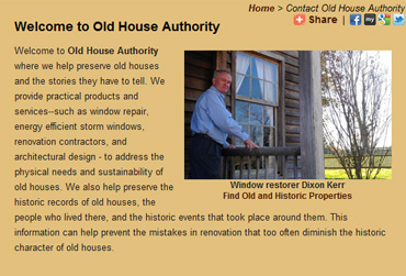
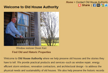
Example: www.oldhouseauthority.com/about
Benefits: Scattering images makes an otherwise boring page look much more interesting. It also won't slow down the page load speed because typically you only have 2 or 3 images...and if you happen to have a couple more than they're far down on the page and the reader can view the top portion while the rest of the page loads in the background.
Downside: If you include too many pictures it looks very cluttered. You need to have a good text to picture ratio...make sure that there's still a lot more text than pictures. If you have too many pictures than you'll need to use a photo gallery like a...
Note: Sometimes these slideshows are set up so that when you click "Next" the entire web page has to reload. We don't like that kind. It takes too long to wait for the next photo to reload every time.
Example: www.oldhouseauthority.com/experts/chandelier/roeper.php
Benefits: With this type of slideshow you save a lot of space. You can put a dozen or more pictures in a box which conserves space for your text. And it of course gives the user control over what pictures they want to look at.
Downside: This type of photo gallery sometimes takes longer to load initially. That's because it's loading all the pictures at once to avoid having to reload the page every time you click "Next". So if you want to use a lot of photos (more than 20 or so) than your page will take a little longer to load.
Example: www.chincoteaguechamber.com
Benefits: The fade effect is what makes this photo gallery look good. It's a great way to give users that "wow" factor when they first come to your home page.
Downside: Sometimes if the page is still loading, the first transition from one photo to another can be a little jerky. Once the whole page has loaded that won't be an issue. Also if you have too many photos rotating in the gallery it will eventually slow down the page load speed.
We hope these little examples will give you some great ideas for your website. Remember...it's not just the pictures which make a great website but also how you present them. Good luck!
Don't forget to let us know if you're interested in improving your website or just want some consulting help.
It's not just how good your photos are that matters, but also how you present them. For example, if your website is cluttered with photos then it won't be attractive. No one likes clutter.
Another way to make your site look unprofessional even with good photos is to not size them properly. If they're too small then they're unimpressive and won't get noticed. If they're too large than they're overwhelming. The right balance is necessary.
Here are the 4 best ways to incorporate pictures into your website:
1. A "thumbnail" photo gallery
Explanation: Take your photos, and make 2 copies of them. One copy is the full sized photo, the other copy is a small little "thumbnail" version. Set it up so that when the users clicks a thumbnail, the full size version pops up in an attractive format.Example: Our portfolio page at www.freshlookwebdesign.com/portfolio
Benefits: You can post a lot of pictures without slowing down the page load speed because the large images aren't loaded until you click on them.
Downside: No huge downside here, but one thing is that the thumbnails on the page won't look as good as a full sized image would. In other words, there's no real aesthetic value until the images are actually clicked on.
2. Scattered images
Explanation: Instead of having only a lot of text on a web page, put some photos here and there to break it up and make it look more interesting. This style is similar to what you might find in a newspaper where you have a story with a photo off to the side with a caption.Example: www.oldhouseauthority.com/about
Benefits: Scattering images makes an otherwise boring page look much more interesting. It also won't slow down the page load speed because typically you only have 2 or 3 images...and if you happen to have a couple more than they're far down on the page and the reader can view the top portion while the rest of the page loads in the background.
Downside: If you include too many pictures it looks very cluttered. You need to have a good text to picture ratio...make sure that there's still a lot more text than pictures. If you have too many pictures than you'll need to use a photo gallery like a...
3. Controllable Slideshow
Explanation: A controllable slideshow is a user controlled picture slideshow. The user is automatically shown the first picture, but is required to click "Next" to make the next picture appear. Another way to do it is have small thumbnails below the slideshow which can be clicked on.Note: Sometimes these slideshows are set up so that when you click "Next" the entire web page has to reload. We don't like that kind. It takes too long to wait for the next photo to reload every time.
Example: www.oldhouseauthority.com/experts/chandelier/roeper.php
Benefits: With this type of slideshow you save a lot of space. You can put a dozen or more pictures in a box which conserves space for your text. And it of course gives the user control over what pictures they want to look at.
Downside: This type of photo gallery sometimes takes longer to load initially. That's because it's loading all the pictures at once to avoid having to reload the page every time you click "Next". So if you want to use a lot of photos (more than 20 or so) than your page will take a little longer to load.
4. Fading Slideshow
Explanation: The fading slideshow is one of the most popular ways to display pictures on the web. Basically it's a picture that fades in and out every few seconds into a different picture.Example: www.chincoteaguechamber.com
Benefits: The fade effect is what makes this photo gallery look good. It's a great way to give users that "wow" factor when they first come to your home page.
Downside: Sometimes if the page is still loading, the first transition from one photo to another can be a little jerky. Once the whole page has loaded that won't be an issue. Also if you have too many photos rotating in the gallery it will eventually slow down the page load speed.
We hope these little examples will give you some great ideas for your website. Remember...it's not just the pictures which make a great website but also how you present them. Good luck!
Don't forget to let us know if you're interested in improving your website or just want some consulting help.
Website Blunders - 8 Mistakes to Avoid
Sometimes the easiest way to approach the question of "What Makes a Good Website?" is to answer the question "What Makes it Bad?" In this post we'll look at the top 8 mistakes that are very common in websites today.
1. Website has no clear purpose
A website should have a clearly defined purpose. Figure out what the purpose is, and then make sure it's clearly communicated on your website, particularly on your home page.
Do you want users to register for events? Then make it easy for them by putting a button that says "Register here!" Do you want them to donate to your non-profit organization? Help them to do that by putting a very clear "Donate Now" link on your front page. A website with no clear purpose will not leave a lasting impression on your visitors...make sure you communicate your purpose.
2. The website is not consistent
As users navigate from one page to another, the layout, font size, font type, color, etc. needs to remain consistent. Imagine reading a book where every time you turn the page the words are in different places or different sizes. It takes you a few seconds just to figure out what it is you're looking at.
Make sure the main page text is the same size, color, and type everywhere. It's good to have headings that are bigger or maybe a different font type...just not the main text. Also make sure you don't have some text in all caps and some in small caps...we recommend small caps throughout.
3. The content is outdated
Because a website often gets forgotten in the day to day operation of the business, it's easy to have outdated content. Users hate this...you must make sure everything on your site is current and not out of date.
Set a weekly or monthly reminding in your calendar "Check Website". That way you can make sure you're up-to-date.
4. Where's the contact info?
It's usually a good idea to put the contact information of your business on every page. Maybe it looks good at the top, maybe you want it at the bottom or side - the point is to have it somewhere, and ideally on every single page.
There are two main reasons for this: first of all, and most obviously, it's something that your users need to know in order to contact you. But secondly, Google uses the contact information on you site to determine the locality of it, so that when users in your geographic region search for you they're much more likely to find you.
5. The website is too cluttered
The best way to fix a cluttered website is to organize what's important and what's not. The important things deserve precedence on the page, and the less important things can either be removed, or just put in a less prominent place.
Another important way to make a website less cluttered and easier to read is to add extra space in between each item. There should be a gap in between the words on the page and everything else. It's called "white-space" - it doesn't have to be white obviously but make sure that there is plenty of extra room in between the elements on the page.
6. Using too much color
Having too much color on your site is an indication of trying too hard to make it look fancy. You can make important things stand out without using colors that don't match the rest of your website. Keep one or two main colors, with maybe a third color used very sparingly. Too much different colors and the site will just look too busy.
7. The text is hard to read
For almost all professional websites, we recommend using a very light background color with a very dark text color on top. The background color doesn't have to be pure white, it can have a tint of gray or off-white. And the text doesn't have to be pure black, sometimes a very dark gray looks nice as well as other dark colors.
8. Using too many pictures
Yes - you can use too many pictures on your website. Actually to be more accurate...you can't have too many, you just have them in the wrong places.
You should definitely scatter pictures throughout each page of your website - but we recommend keeping this to a minimum. One or two pictures next to the text looks nice...5 or 6 is overwhelming, plus it just slows down the page load speed.
A better place to display a large number of pictures on your website is through a photo gallery. By using smaller versions of the photos called "thumbnails", you can put a large number of photos on a page without slowing down page load speed. You can also present an even larger, higher quality photo that you could otherwise. An example of this is on our website portfolio page.
We hope these suggestions help you with your website, whether you manage it yourself or have hired someone to do it for you. If you need assistance with your website please contact us and we'll be happy to give you a free consultation.
Tuesday, February 1, 2011
What are Facebook's new privacy settings, and should you be alarmed?
What is Instant Personalization?
Instant Personalization by Facebook has long been in the making (since April of 2010) but only recently has it been implemented. So what is it exactly?
Essentially, Facebook is now sharing part of your personal profile with other websites. It seems really scary at first, and many users have a right to be freaked out by this concept, but it might not be quite as dangerous as it sounds.
First of all - it's only a select few websites. Rotten Tomatoes, TripAdvisor, Clicker, Pandora, and Yelp as well as a couple more are the sites your information is being shared on.
Secondly, it's not sharing private information with non-Facebook friends. So whatever information you have set as public (who your friends are, your profile picture and your name) will be available - not your home town, status updates, or anything like that. In other words - they can't see anything that they couldn't already see by going to your Facebook page.
The idea behind it is to make the sites even more social and more personal. Take movie review site Rotten Tomatoes for example - when you go to their page, you'll see that some of your friends like a certain movie. They can also see what movies you like.
It's basically taking some of the information you've already given to Facebook and sharing it on other sites. Friends can see it, but no one else.
Let's say that your friend Bob clicks the "like" button for the movie Gone with the Wind. When you go to Rotten Tomatoes you will see that Bob "likes" that movie, and you may be interested in watching it yourself.
What Facebook users are particularly annoyed with is that Facebook automatically installed this feature...rather than it be an opt-in feature, you're enrolled automatically. It's a little unsettling to go to a new website that you've never been before, and for it to have a picture of you with your name on it. How did they get that info? Well, it's public information on your Facebook page. But that doesn't mean it isn't going to freak out a lot of people.
What you should do
First of all, make sure you know exactly what information is public and private on your Facebook page. We do not recommend letting non-friends see your pictures. And if you're even just a little bit private, make sure that friends of friends can't see your pictures either.
Secondly, if you feel uncomfortable about Instant Personalization, then just opt out. Here's how you do it (it's kind of hidden):
Go to Account > Privacy Settings > Apps and Websites > Instant Personalization > Edit Settings, and un-check "Enable".
The important thing to know is that as long you are comfortable with your privacy settings for Facebook itself, then you have nothing to be worried about as far as security. Nothing not already public is being shared...the only difference is that now it's being shared in several different places. However it would still be nice if Facebook was a little more sensitive about sharing our information with other websites.
Wednesday, January 19, 2011
How to Get Started on Your Website
Want to know how to get started on building your website? If you're like most people, you have questions in areas such as:
There are some goals which apply to all websites:
Checking out the competition, targeting your audience, and setting goals for your website are the foundation of every good website. Sometimes just taking that first step is half the battle, and if you do these 3 things you're off to a fantastic start.
- How to even begin
- What all the terminology means (domain names, hosting, DNS, CMS, CSS, HTML, SEO)
- What should the end product look like
- What to look for in a web development company
- What options do you have to include in your website (like photo galleries, video, social media, PayPal, etc.)
Who are my competitors online?
This is ALWAYS the first question we ask people who get a new website. This is what you should do:- Go to Google.com
- Type in your industry, and the city and state - example, "web design companies, hampton virginia"
- You should hopefully recognize some of the top hits - they're you're competitors. Make a list of the top 4 or 5 websites that come up. Whether you like everything about their website or not, make notes about what they do well, what they don't do well, what you like, don't like, what you'd like to improve upon, etc.
Who is my audience?
Figure out who you're trying to reach. There are many different ways to break up your market:- Age
- Geographic location
- People with a certain interest
- Businesses
- Parents
What do I want people to do when they visit my website?
This may sound simple but it's a tough question to answer. Your website needs to be driving people towards accomplishing a goal. People don't usually browse aimlessly and then decide to purchase...they're looking for something in particular and they need help finding it.There are some goals which apply to all websites:
- Post contact information so people can contact you
- Improve your image with a professional design
- Get found on the search engines
- Post general information about your company on your About Us page
- Download your brochure
- Fill out a contact form
- Make a purchase
- View your portfolio or pictures
- Register for an event
- Apply for employment
- "Click here!"
- "Call now!"
- "Download our brochure"
- "View our portfolio"
Checking out the competition, targeting your audience, and setting goals for your website are the foundation of every good website. Sometimes just taking that first step is half the battle, and if you do these 3 things you're off to a fantastic start.
Monday, January 17, 2011
How to easily update your own website
Are you ready? This is probably the best way to save your company lots of money. Don't pay a professional every time you update your website. Don't hire a full time employee to manage your website for you. Do it yourself. Or hire an intern to do it for you. It's EASY. Here's how it works:
Get a web developer or someone to help you set up your website into a "Content Management System" (or CMS). A CMS is just a way to manage your web content easily. The most important feature about a good CMS is that you don't have to know HTML or how to code or program. That would be a good thing.
The concept behind each CMS is the same. Your website is setup in templates, with pages associated with each template. You don't usually change the template, but rather the content inside the template.
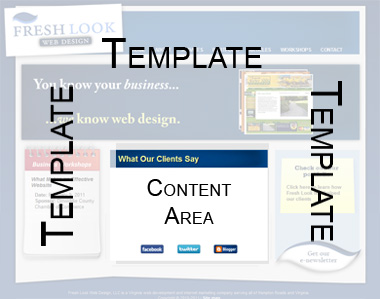
Some CMS's only let you change the content area. Others let you edit the template as well, although that usually requires HTML coding. Below we'll take a look at a few CMS's and the pros and cons:
1. Dreamweaver Templates
Although maybe not technically a CMS, having a site set up in DWT's is a common way to manage your own website.
Pros:
Grade: C+
2. Contribute
Also by Adobe like Dreamweaver, Contribute is actually compatible with Dreamweaver Templates. This software is a step down from Dreamweaver, and simplifies a lot of what DW can do.
Pros:
Grade: C
3. WordPress
WordPress is a blogging platform which can also serve as a CMS for your website. WordPress is popular and easy...and if you like blogging it is ideal.
Pros:
Grade: B+
4. Joomla
Joomla is a very robust, sometimes complicated CMS designed for any size website. Fresh Look Web Design uses Joomla more than any other CMS because of the flexibility and performance it offers our clients.
Pros:
Grade: A+
Here's our recommendation - if you want a website, you need to update your website. If you update your website, you need to do it cost effective...which means you need a CMS. Our top choice is Joomla, but pick the one that fits your needs the best.
Get a web developer or someone to help you set up your website into a "Content Management System" (or CMS). A CMS is just a way to manage your web content easily. The most important feature about a good CMS is that you don't have to know HTML or how to code or program. That would be a good thing.
The concept behind each CMS is the same. Your website is setup in templates, with pages associated with each template. You don't usually change the template, but rather the content inside the template.
Some CMS's only let you change the content area. Others let you edit the template as well, although that usually requires HTML coding. Below we'll take a look at a few CMS's and the pros and cons:
1. Dreamweaver Templates
Although maybe not technically a CMS, having a site set up in DWT's is a common way to manage your own website.
Pros:
- Complete control of your site
- Simple
- Doesn't require a database
- Extremely mobile
- Easier to undo mistakes
- Not too difficult to change template
- Requires file upload - computer skills required
- You have to purchase the software (about $250)
- Takes longer to make changes (have to wait for files to upload)
Grade: C+
2. Contribute
Also by Adobe like Dreamweaver, Contribute is actually compatible with Dreamweaver Templates. This software is a step down from Dreamweaver, and simplifies a lot of what DW can do.
Pros:
- Very simple
- Cheaper than Dreamweaver (about $100)
- Hard to make mistakes
- Extremely mobile
- Can't change the template very easily
- Have to purchase software still
- Can be buggy
Grade: C
3. WordPress
WordPress is a blogging platform which can also serve as a CMS for your website. WordPress is popular and easy...and if you like blogging it is ideal.
Pros:
- Very easy to use
- Free
- Great for blogging
- Has many plugins such as shopping cart, contact form, SEO, etc.
- Widely supported so if you have a problem, so do other people. Google it.
- Easier to add new pages than Dreamweaver or Contribute
- While it does have a shopping cart plugin, it's not great for e-commerce
- Limited in functionality. The plugins are generally basic. A large, professional corporate website would need more than WordPress
- It's not developer friendly. Upgrades to the system may cause bugs, requiring you or your developer to fix it.
Grade: B+
4. Joomla
Joomla is a very robust, sometimes complicated CMS designed for any size website. Fresh Look Web Design uses Joomla more than any other CMS because of the flexibility and performance it offers our clients.
Pros:
- Free
- Has fantastic plugins, particularly the calendar, business directory, and SEO upgrades
- Developer and designer friendly
- Easy to create multiple templates
- Very widely supported and great community of developers
- Easy to modify template and add pages
- Can be more difficult to learn if not trained properly
- Not as intuitive as WordPress
Grade: A+
Here's our recommendation - if you want a website, you need to update your website. If you update your website, you need to do it cost effective...which means you need a CMS. Our top choice is Joomla, but pick the one that fits your needs the best.
Subscribe to:
Posts (Atom)
